Kudykina Gora: signature style
Logo and signature style
Based on the analysis of the park, the requirements for the future corporate identity were formed:
 |  |  | ||||
| Infinity of variations. The park is so multifaceted that everything needs to be taken into account. | Combinability. All parts must be friends with each other on the basis of some principle | Simplicity and modernity. The park is developing and moving forward in every way, so you can't stay in «folk tales». |
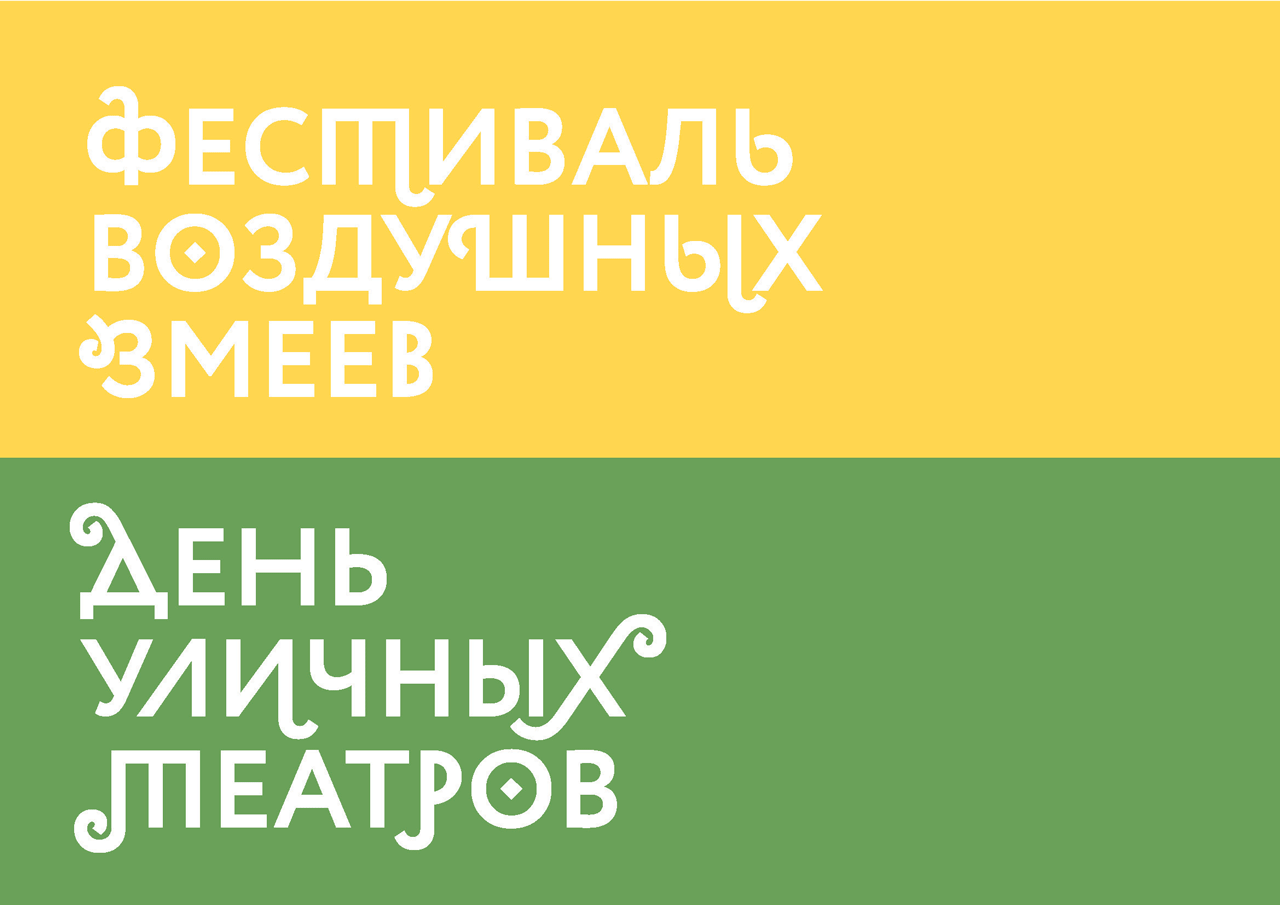
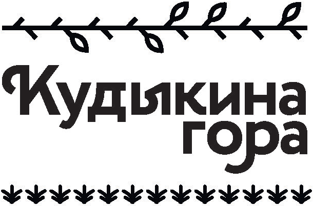
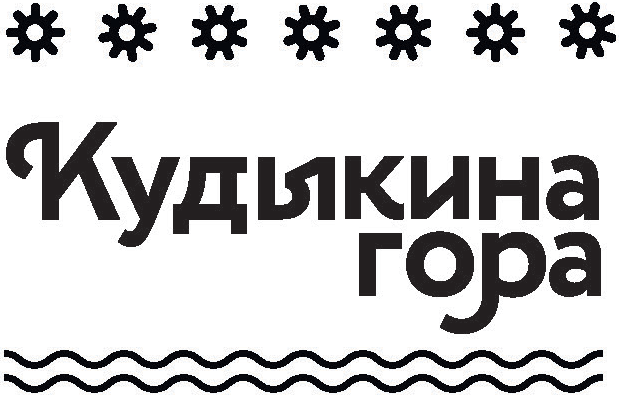
The logo is lettering. The harmonious combination of sharp and rounded elements makes it very lively and modern. Recognizable graphemes of the Cyrillic alphabet (for example, D) have been preserved in the outline to emphasize the character of the park. The sign is slender and dynamic, perfectly readable when scaling.
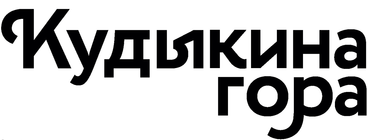
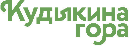
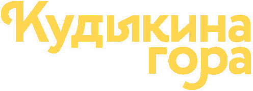
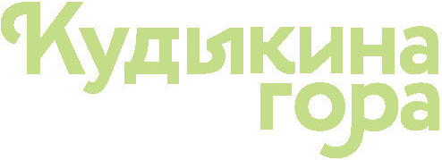
The monochrome version is used in the absence of color printing, as well as in light colors. Colored versions mean painting the logo in a palette of corporate colors.
 |  |  |
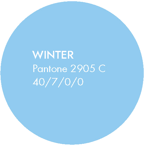
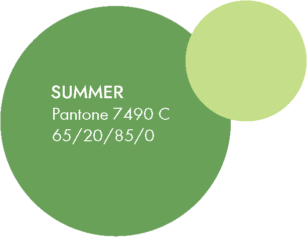
Signature colors
 |  | |||
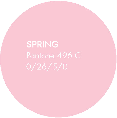 | 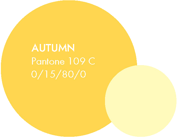 |
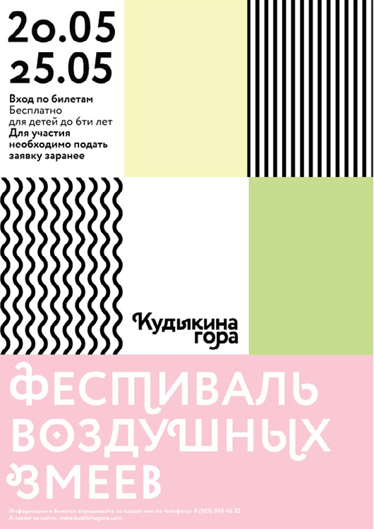
The color scheme combines soft pastels with rich colors. This allows you to create a good contrast in the media, and is also associated with both the natural component of the park and its festival orientation.
Front
Circe is a geometric grotesque with a human face and numerous nice additions. They are a fairly calm geometric sans serif, but alternative letterforms and swash marks can completely change the character of the font.
Additional graphics
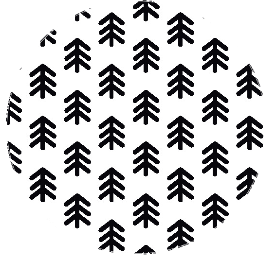
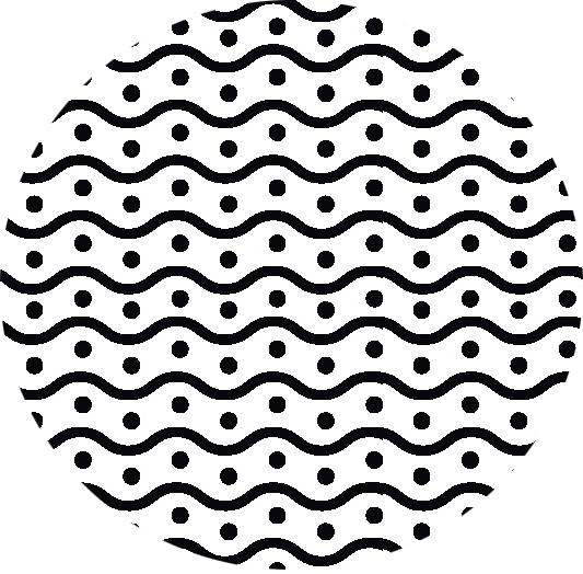
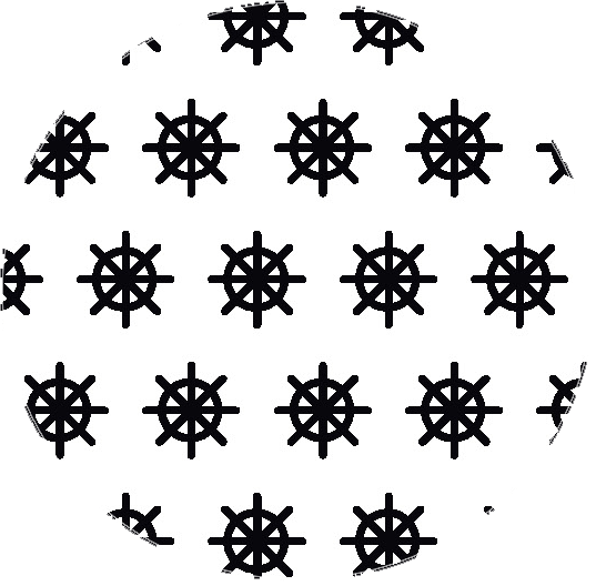
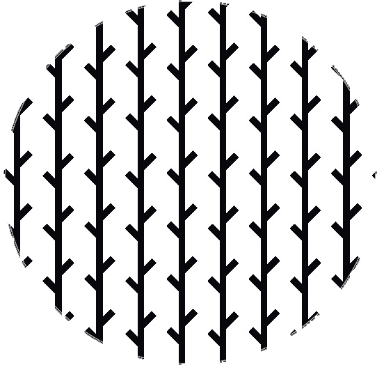
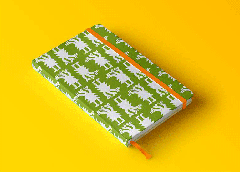
In the form of supporting graphics, patterns have been developed that correspond to various natural elements:
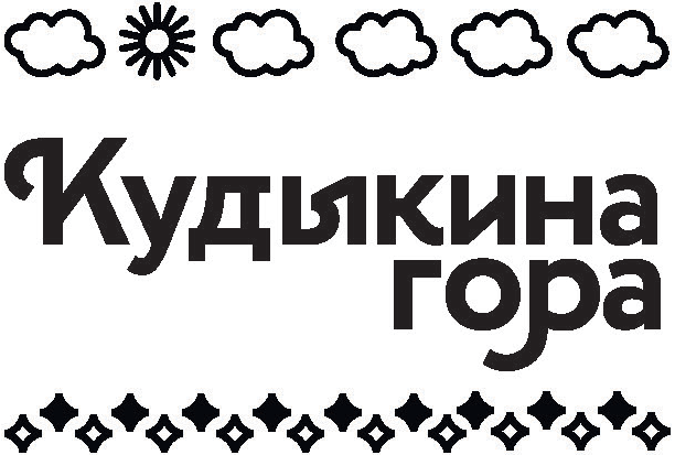
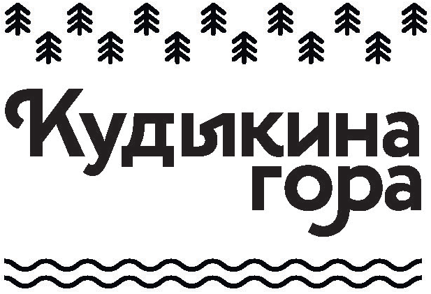
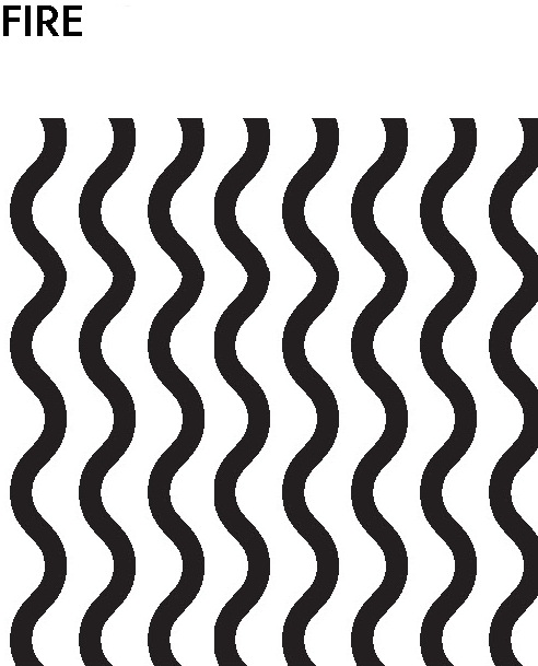 | 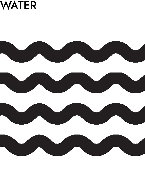 | 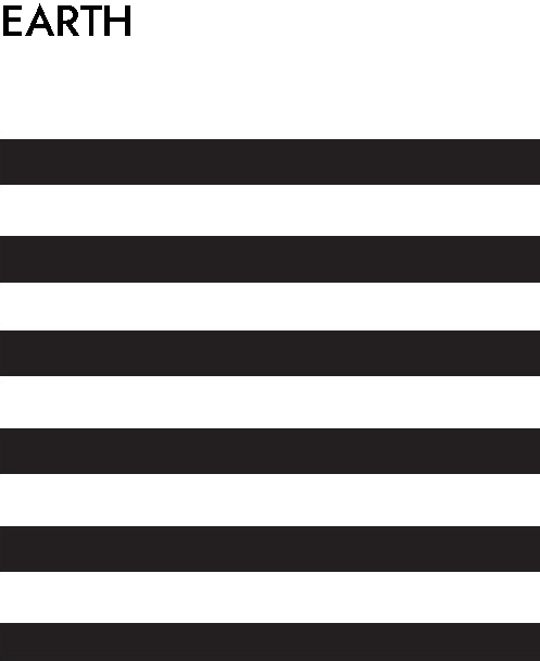 | 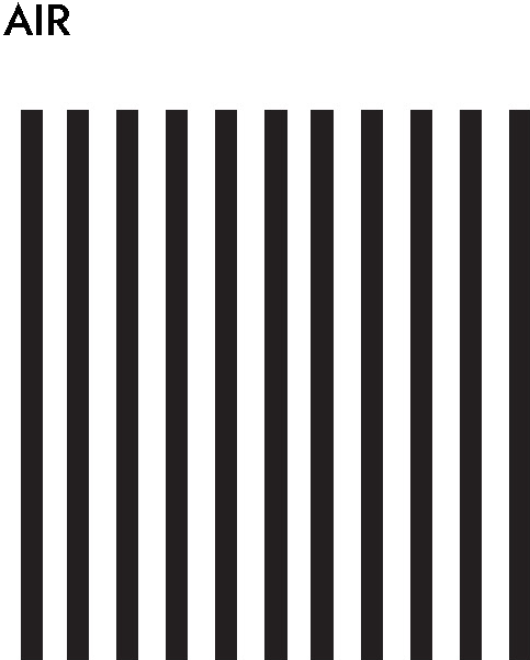 |
The patterns are used exclusively on non-photographic products. Combination of more than two basic patterns on one medium is not allowed.
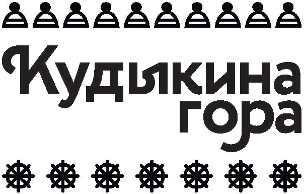
Additional patterns:
 |  |  |  |
Using the logo in combination with patterns:
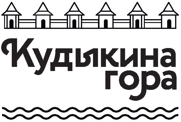 |  |  | ||||
 |  |  |
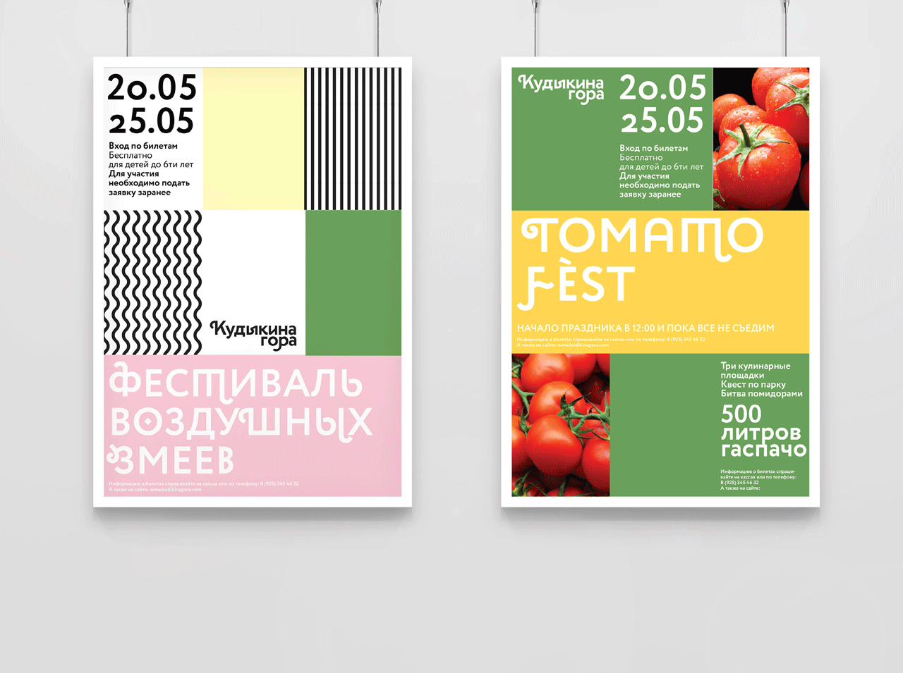
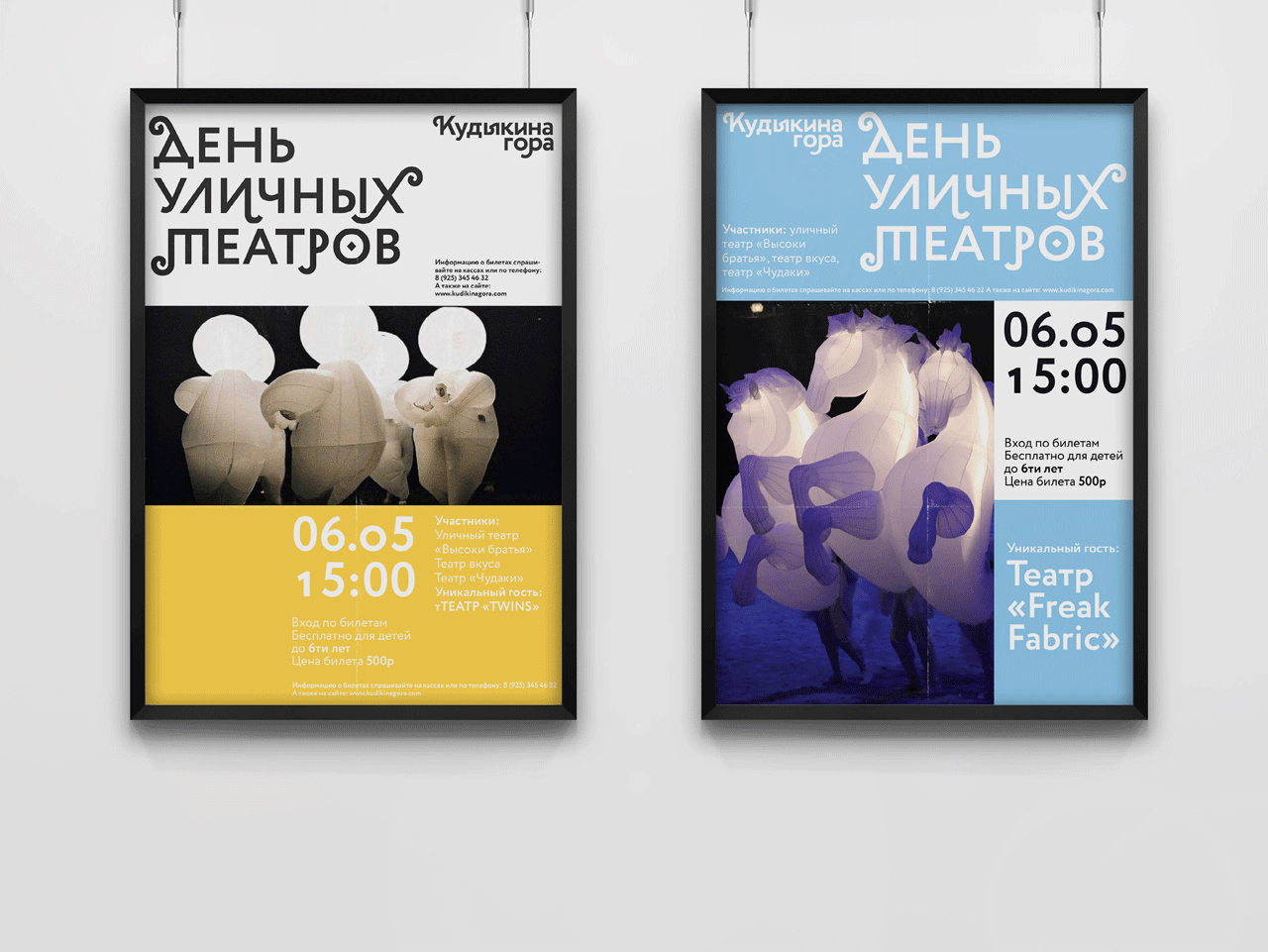
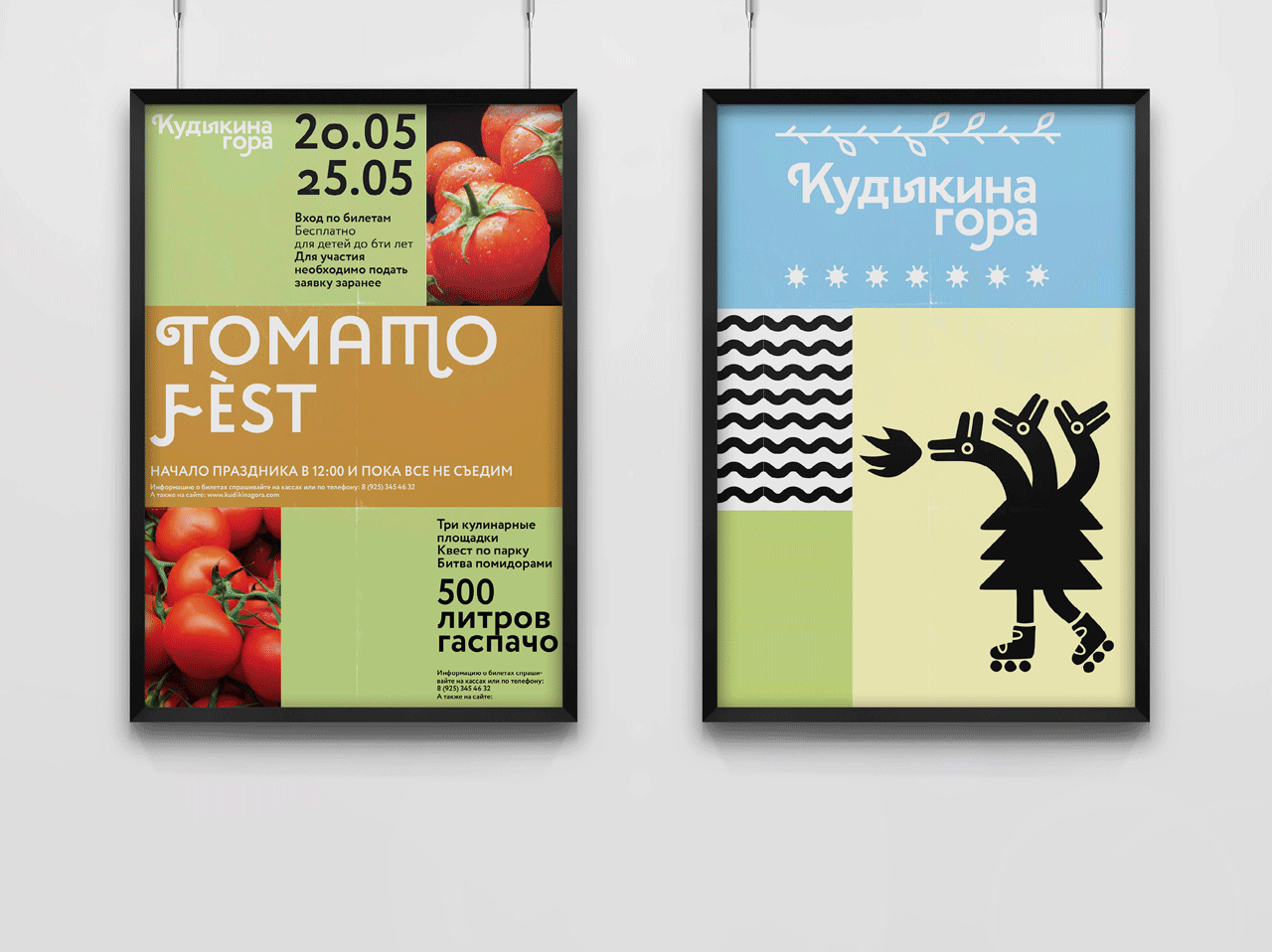
Grid
The grid provides infinity of variations. The three-part system allows you to combine patterns, colors, text, photographs and graphics. Sponsored and affiliate logos will painlessly fit into such a grid. If necessary, each of the parts is also divided into three.

Usage example:
 |
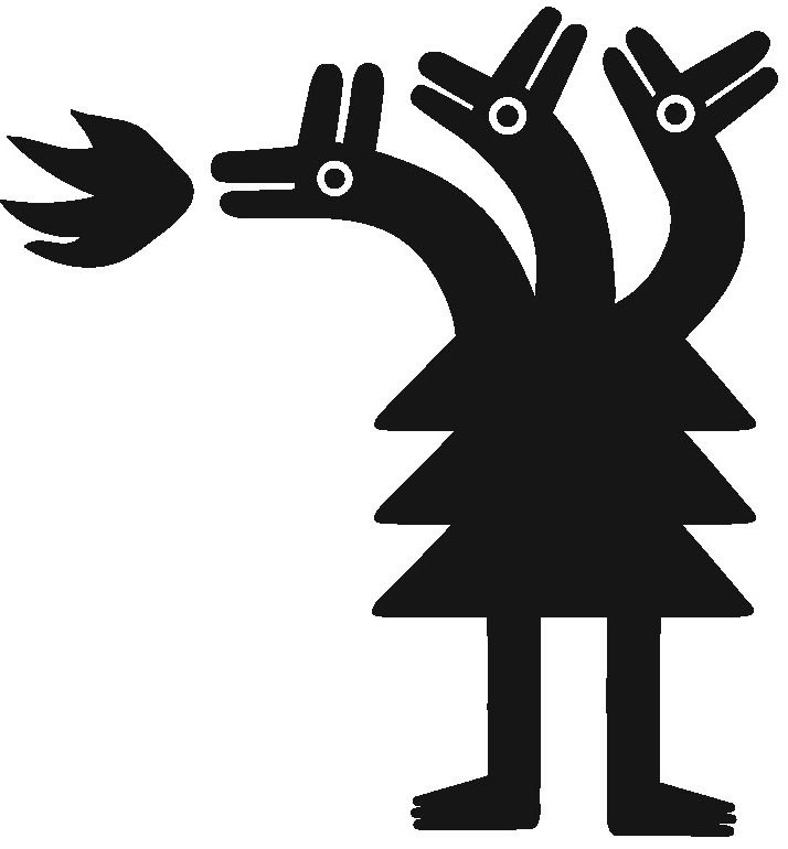
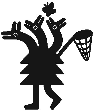
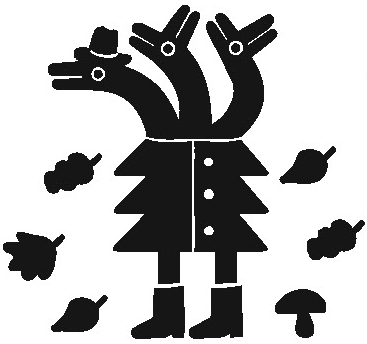
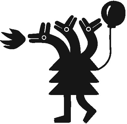
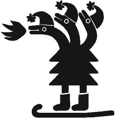
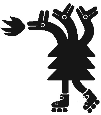
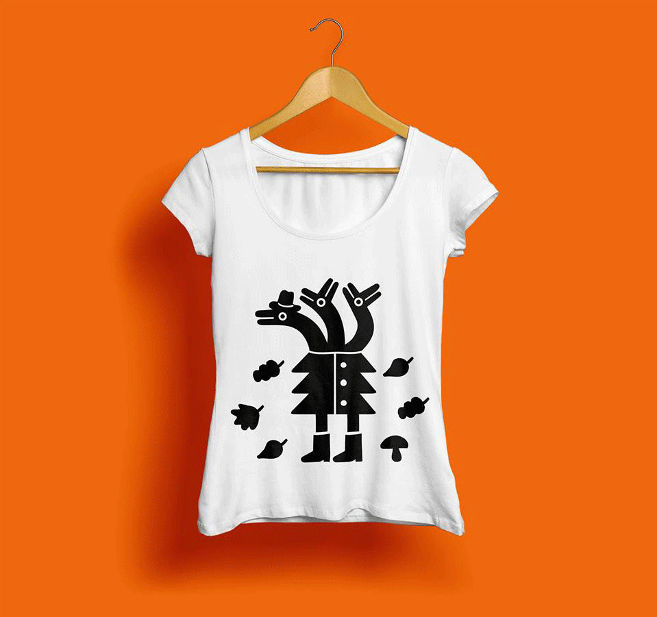
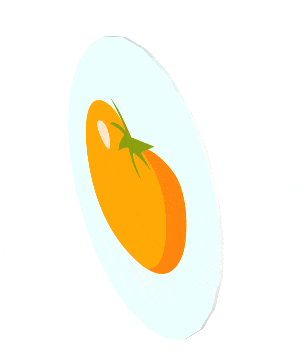
Talisman
The talisman is also three-part: the three-headed Serpent GORynich is a reference to folklore, the EL’ is a natural component and the NOGi symbolizing the campaign. It turned out GoroEleNog.
 |
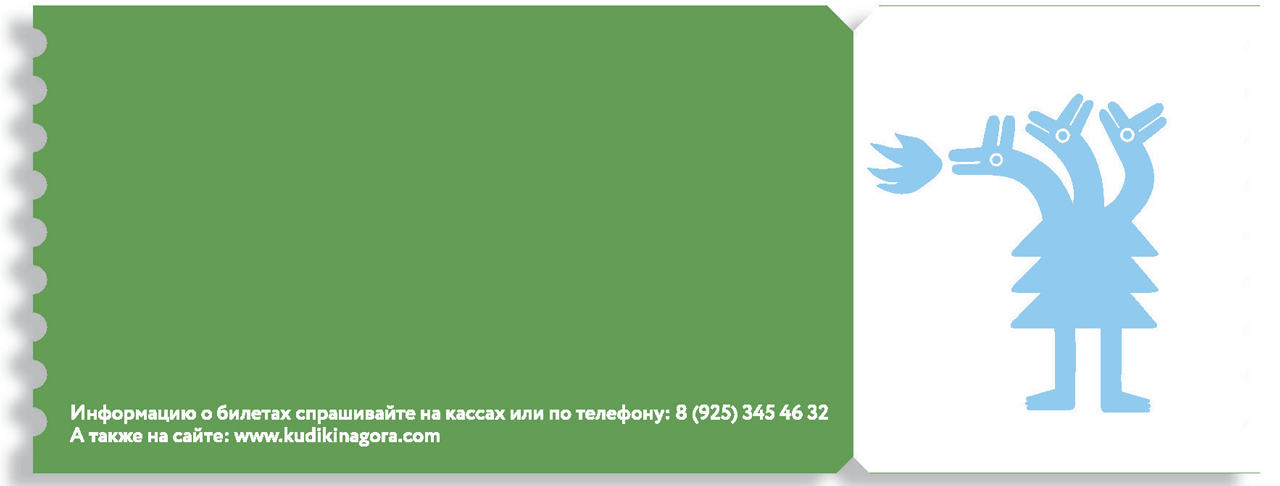
Alternative versions can be used in any souvenir products, as well as in printing materials related to a season or a short-term event:
 |  |  | ||
 |  | 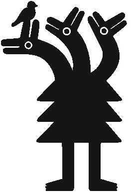 |
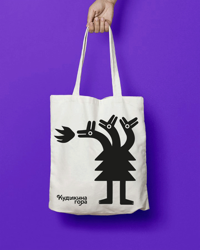
The talisman is used in souvenirs and can be printed on any other media. For official papers (letterhead, corporate business card, etc.), only the main version of the mascot is used.

Map
For orientation on the territory of the park, we have created a guide map, on which you can easily find the object of interest. If you find an object, you put a stamp. Collect all the stamps - a prize! The card motivates to study the entire Kudykina Gora and return again. It became an organic development of the concept, and the circular route became a driver for the further development of the park.
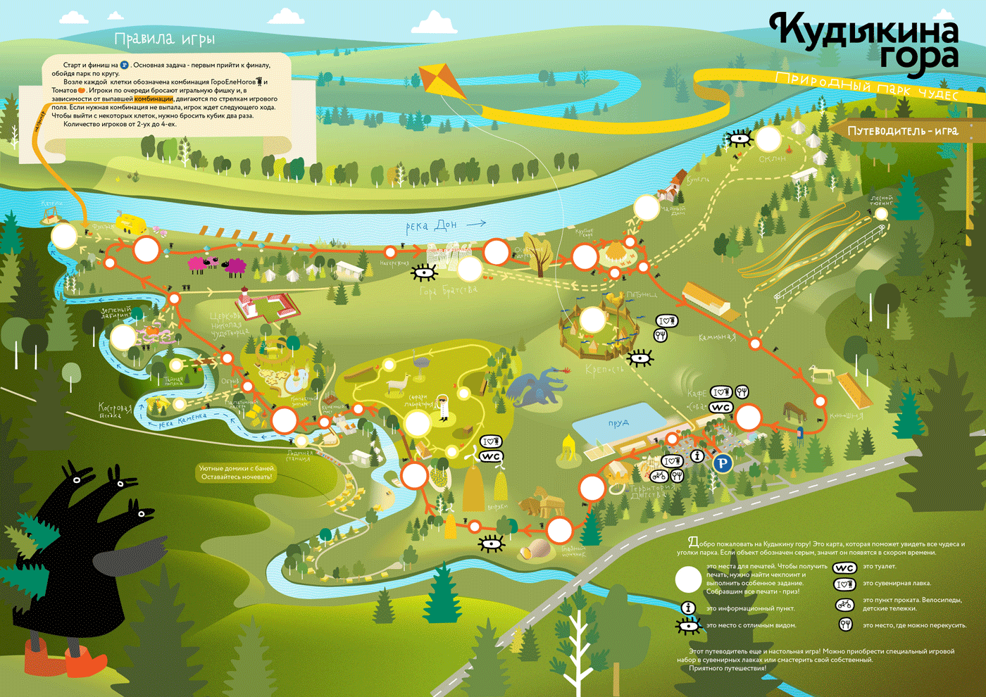

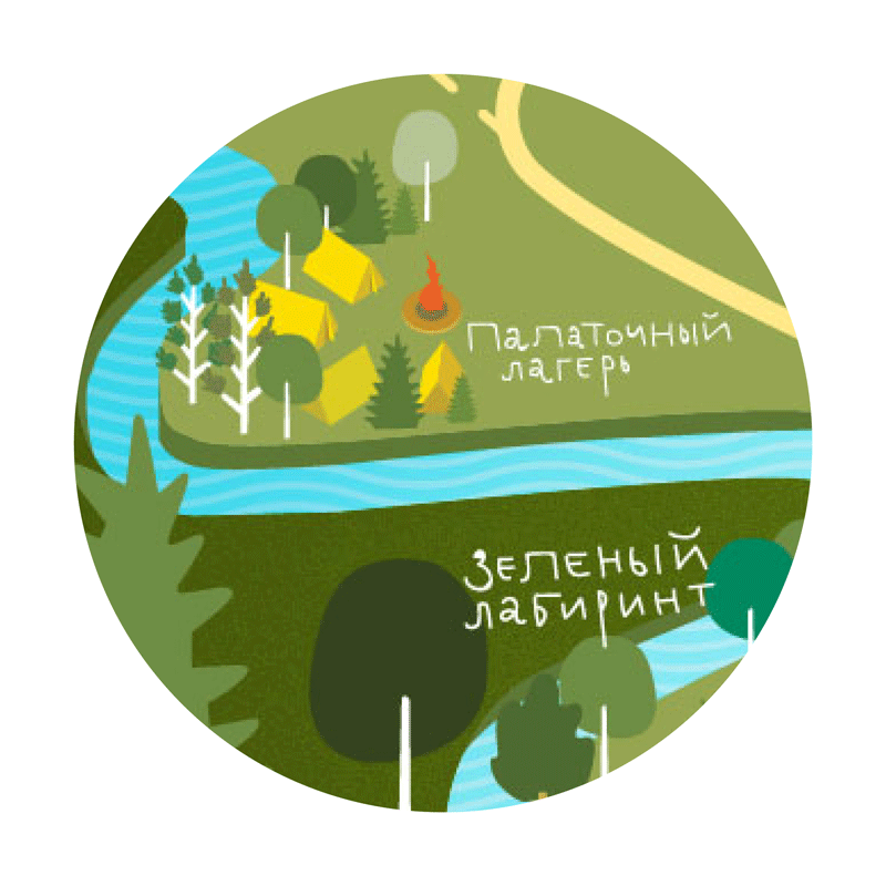
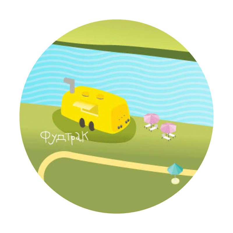

The peculiarity of the card is that it is also a board game. You only need to purchase a playing set of 4 chips and a dice. Everything is very simple: you need to get to the finish line using the marked markers. You can play with friends right in the park or at home to prolong the experience of «Kudykina Gora».
 |  |  |  |  |